Winery Rebrand: Booklet Design + Story = Website
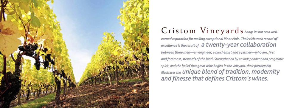
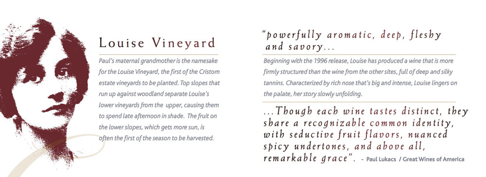
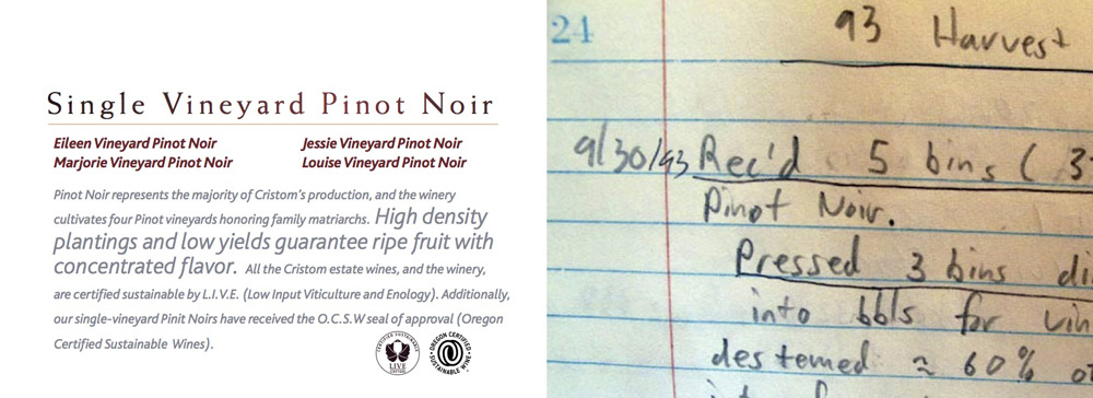
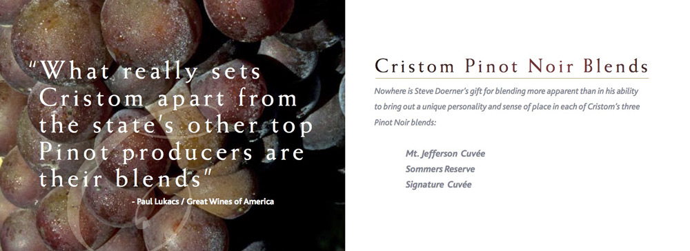
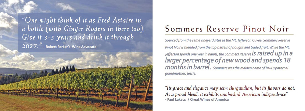
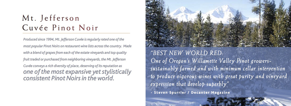
Cristom Vineyards came to me because they wanted update their brand and website for their 20th anniversary with the goal of telling their story in a humble way. I suggested beginning with their story and then finding a way to put it into their customers hands, naturally. As the story was being written, courtesy of gorgeous words from Ellen Jackson, I explored various directions and ultimately selected a hand held booklet as the solution. The small size easily fit into a pocket, bag or purse and was packed with enough pages [32 in fact] that it properly told their story in an elegant way.
The booklet became the seed for the rebrand; with the look & feel, design and the story in place I posted a “construction” page while I redesigned their new website. [There is a great story about how the “construction” quadrupled sales and paid for the website redesign before the new site launched – I’d love to share that with you over a glass of Pinot Noir sometime].
[Use the arrows or the dots to page through a sampling of the Booklet story and design above]
The Website Design
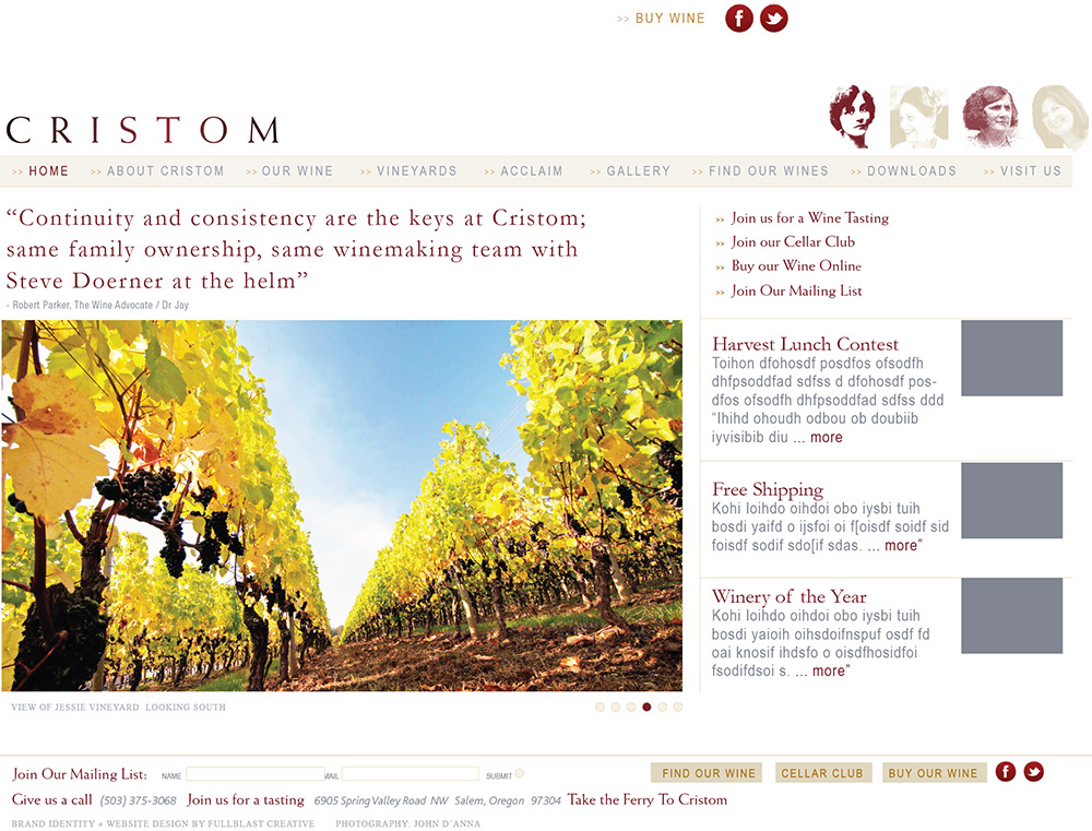
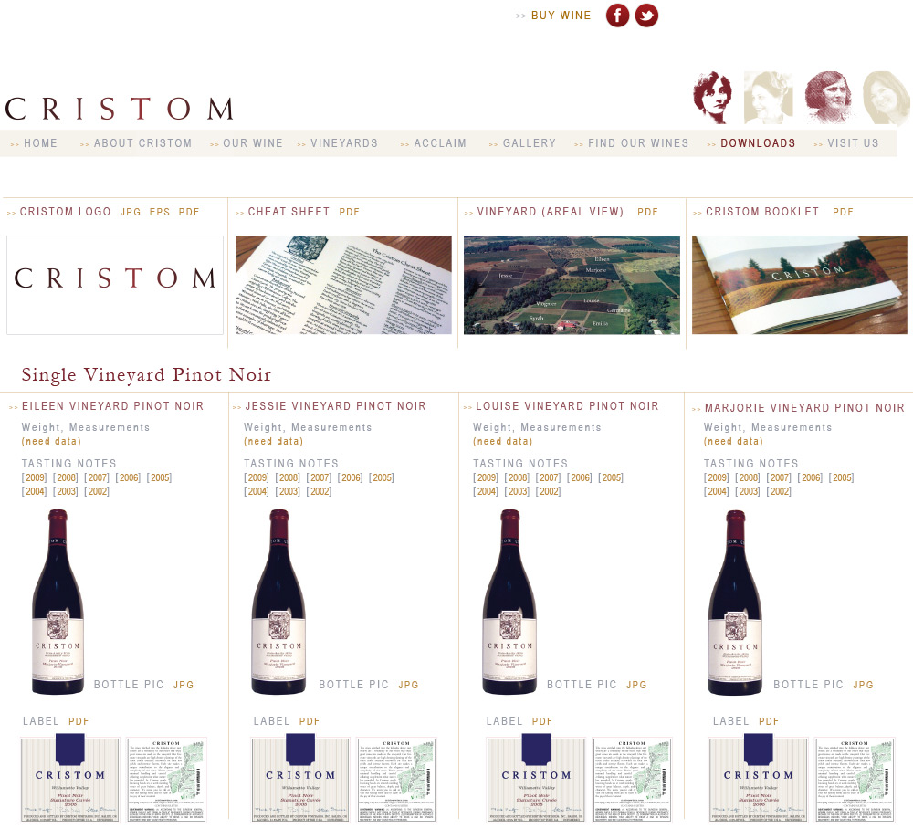
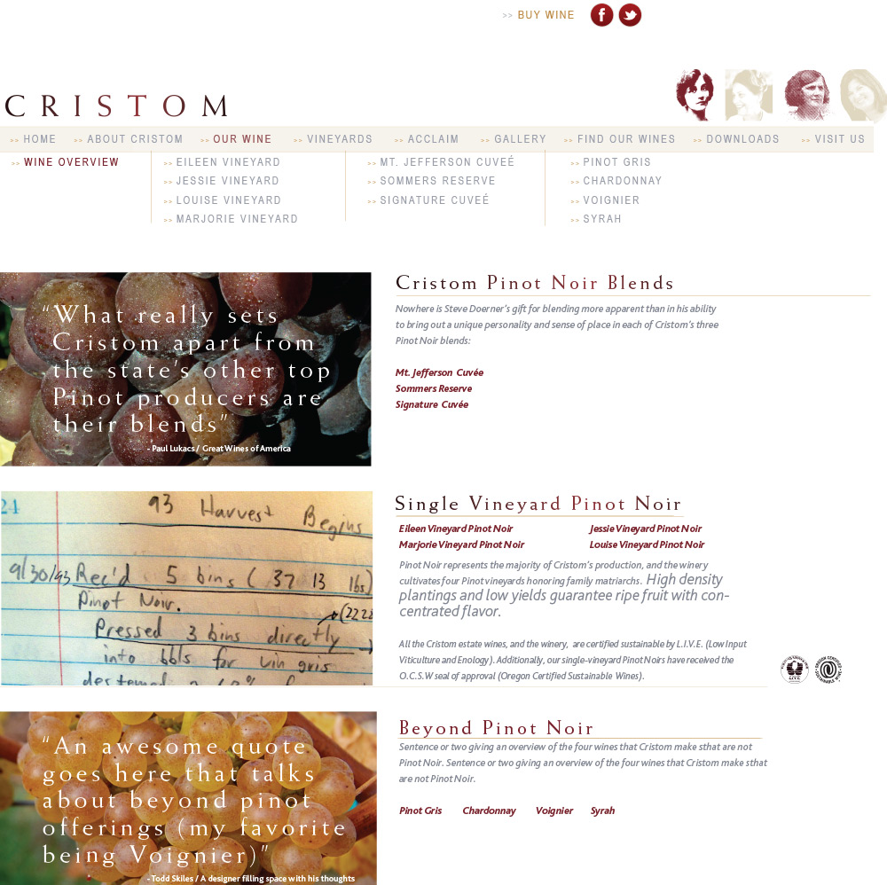
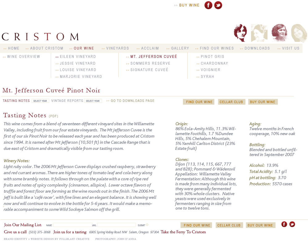
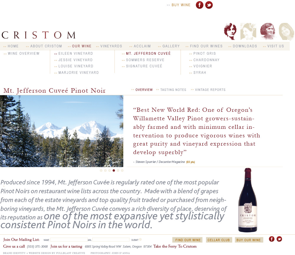
Cristom Vineyard’s new site uses intricately designed custom templates for nearly every section on their website. Scroll down to view a few examples of this custom web design.
Homepage
The homepage [above] features a slideshow with ever rotating beautiful images [courtesy of John D’Anna] and a featured quote. The right side of the site dynamically pulls content from a number of sources so the viewer sees new and current information [reviews, , accolades, events, etc.] with every visit to the site.
Wine Specific Page
Trade Page
Wine Overview Page
Wine Detail Page
